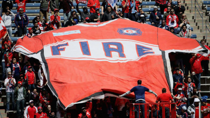
The Chicago Fire are undergoing an identity change, from their stadium to their logo. Unfortunately, the new logo is a step in the wrong direction.
It’s been an eventful offseason for the Chicago Fire. We already knew that the Fire were headed back to their roots and leaving Seatgeek Stadium in Toyota Park to return to Soldier Field, where they played from their conception in 1998 to 2001 and from 2003-2005.
Towards the end of the season, the Fire were purchased by a new owner. Billionaire Joe Mansueto purchased the club from Andrew Hauptman who had owned the club since 2007.
In addition to the return to Soldier Field and new owner, the Fire were rumored to be undergoing a brand change. Unfortunately, that brand change was confirmed on Thursday with the announcement of the team’s new “identity.”
We say unfortunately because, well. See for yourself.
#BREAKING Chicago Fire tweak name to Chicago Fire FC, reveal new logo ahead of Soldier Field move https://t.co/rT8iA1dnyV
— WGN TV News (@WGNNews) November 21, 2019
I’m sorry, but what the heck is that?
The new logo is entirely different from the Fire’s emblem and color scheme over the years. We’re not really sure what the thing in the middle is, but the club claims that it’s intended to be flames inverted to become a crown.
It seems as if no one in the Chicago Fire organization has ever seen fire in their entire life…or a crown.
And why are the flames upside down? Is that supposed to symbolize hell? So many questions…
Though it’s minor news compared to the completely revamped logo, the club also announced that they were changing their name from the Chicago Fire Soccer Club to Chicago Fire FC (short for football club).
That’s fine. That’s great. More of that and less of the weird Star Wars looking battleship.
At the beginning of 2018, English Football League Championship club Leeds United announced a new logo, but it was met with a bombardment of backlash. Shortly after the announcement, the team pulled an about-face and opted for a new logo that’s quite similar to the previous one.
Let’s hope and pray that the Fire pull a Leeds and stick with something more along the lines of their original logo and color scheme.
Fire fans have to deal with enough given the team’s struggles over the years. The last thing they need is to be the aesthetic laughingstock of the MLS.
